revitalising Ziggo
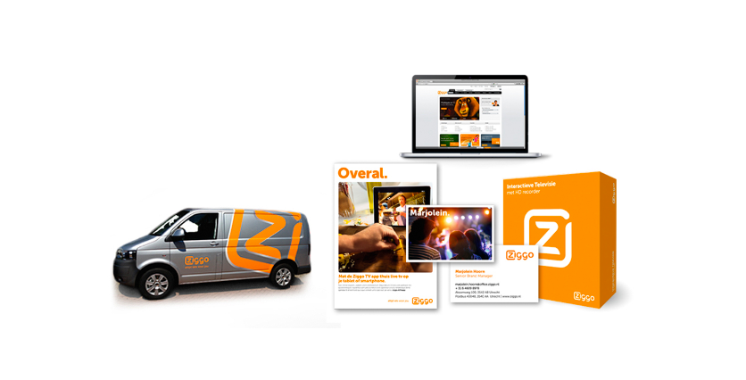
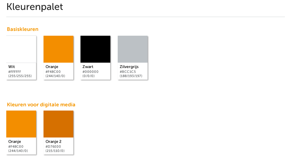
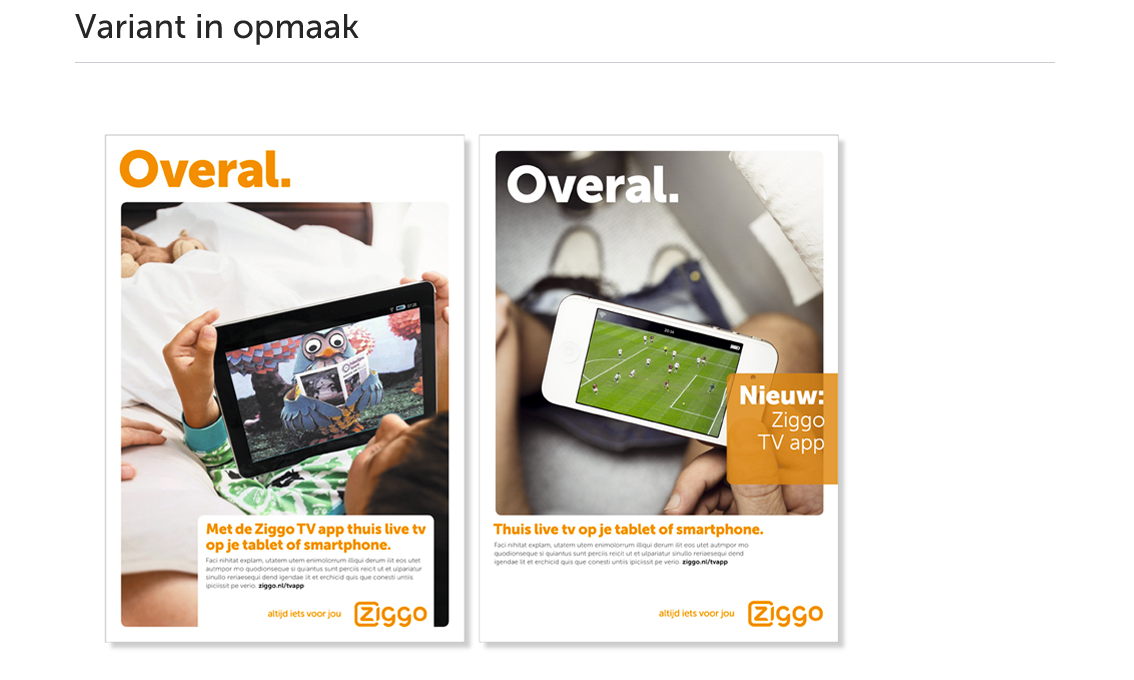
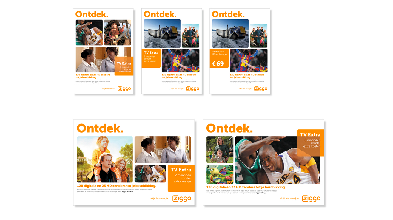
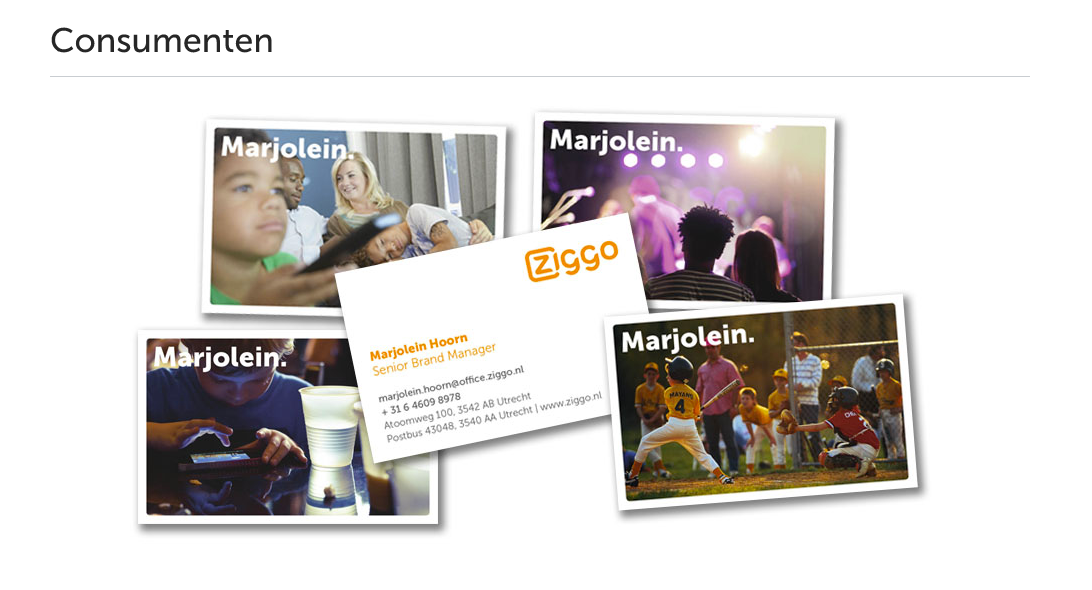
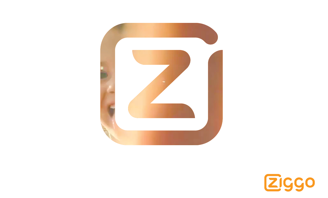
Ziggo is one of the major players offering TV,internet and phone services in The Netherlands. It's identity was a mess. Nobody knew who Ziggo was anymore. Too much colours, no clear photography. In a small team of advertising people and designers we managed to make Ziggo a strong brand with a clear face and a more humane feeling. We introduced the Z-device as a logo. Through this Z you'll see the world of the user. The photography style we introduced was a major step in becomming more humane in appearence. I cannot show all examples, while we are still shooting the corporate photography. But here is a quick look in what is now being developed.
Advertising Agency : DDB, Eigen Fabrikaat
Design Agency : Aestron